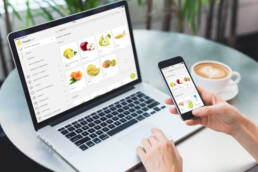
CompanyFoodsProjectGrocery Delivery PlatformYear2017Linkfoods.clRoleProduct Manager & Lead Designer
Foods.cl is an online supermarket of fresh groceries with a custom shopping experience for each user. Based in Santiago (Chile), its value proposition is clear: “connect directly the farmer with the final consumer”. By facilitating, on the one hand, the purchase of fresh and organic products in a simple, intuitive and personalized way and, on the other hand, receiving these products quickly, comfortably and free of charge at home.
Foods was born as a startup in Santiago de Chile. They built their initial e-commerce platform in Wordpress with WooCommerce plugin, so they had a bad user experience and a lot of steps to make a purchase, however it worked to validate their business model. But in early 2017 they had more than 1,000 recurring customers a month and needed to improve and optimize their sales platform to increase the conversion and simplify the buying process.
I led the Product Design and Management of Foods.cl for iOS and Android apps and the Responsive Web since the outset of the project in January to April 2017. I led efforts to evolve the service and address customer pain‐points related to the browse and discovery experience.
Main responsibilities
- Analyze other options in the market and their solutions, as well as research the Foods regular customer and discover recurring behaviors.
- Translating business goals, user needs and product strategies into user experience, use cases, user stories and features for the development team (up to 5 people).
- Building the product roadmap and maintaining a prioritized product backlog working with Agile Methodologies (Scrum and Kanban).
Tools
Some of the main tools I used to carry out this project
I talked with some regular customers to understand their behavior and main pains and gains. As well as analyzing other options on the market and their solutions. Also, I studied analytics to understand flows.
- 75% of the users entered through the mobile as opposed to 25% that they did through the computer, however the mobile had a lower conversion.
- The target profile of the recurrent user was analyzed and found that 90% of users repeated 80% of the products in each of their purchases. In addition they used to do the weekly shopping in small breaks during work so they needed speed.
I grouped the users by similarity in needs and objectives. Then I made a User Persona, an Empathy Map and a User Experience Map for each of them to define their main Pains and Gains during the use of our referral program.
Main pains
- The main problem for recurring customers is that there was no way to repeat the same purchase on the platform, including or excluding some products. They could see the purchase they had made previously but to make it again they had to add product to product again.
- The mobile user experience was poor, as there was a lot of mobile traffic, however, the conversion was quite low compared to the desktop web. This could indicate that there was interest in making the purchase but it was very complicated.
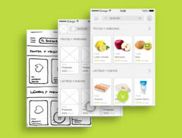
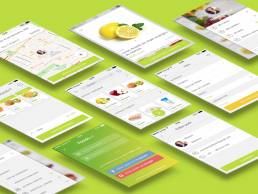
Due to the recurrence of products, we think of Foods as a personalized supermarket for each client where they can make the weekly purchase in less than 3 minutes using only their thumb to interact with the application (on mobile phones and tablets). I started designing with mobile first, since it was their main channel. This helped us to simplify the functionalities to those strictly necessary and to reduce the steps to make a purchase.
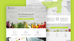
Fruits, vegetables and, in general, all the food that Foods sells have a lot of color and chromatic variety, reason why the new Platform of Foods gives all the prominence to the product. The main buttons are always present at the bottom of the screen and show you the result of pressing on them.
We build the entire Food platform as one page and shows the products most purchased by the customer grouped by categories. It simplifies the process of purchase in 3 steps (add the product to the cart, select date and time of delivery and make the payment).
I did usability tests with some recurring customers, new users and restaurant customers (the three types of customers we had) to understand problems or points for improvement with the proposals. After that, I did some quantitative surveys to solve design problems with the rest of users before implementing.
The feedback we received helped us redesign some of the user experience and add new features.
Finally, I wrote all the specifications and requirements in the Product Requirement Document (PRD) an extensive and detailed documentation with mockups, scenarios, user stories… to facilitate further development.
We prioritize functionalities using the Minimum Viable Functions (MVF) and little by little we improved it, delivering value to the user with each new release.
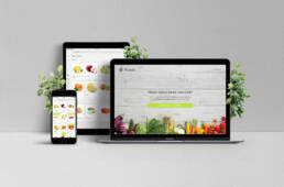
I wasn’t present for the final release (as it was a 4 month project), but the company continues developing the product step by step. Finally, we launched an app for mobile and tablets and a responsive web, as well as several landing pages (the users, restaurants and offices).
Conversion increase up to 22%
Increase of customer satisfaction to 85%
Reduction of recurring purchase time by 5 minutes
I have felt part of that project from the beginning and I have come to fall in love with it, I have been able to contribute my grain of sand and I am very happy that they are as grateful as I am for them.
Ignacio, CEO of Foods.cl, welcomed me from the beginning and showed me that values such as humility, patience and perseverance are fundamental tools for dealing with clients, managing and motivating the team, seeking financing, etc.
