CompanyFoodsProjectSupplier PlatformYear2017RoleFreelance Product Designer
Foods.cl is an online supermarket of fresh groceries with a custom shopping experience for each user. Based in Santiago (Chile), its value proposition is clear: “connect directly the farmer with the final consumer”. By facilitating, on the one hand, the purchase of fresh and organic products in a simple, intuitive and personalized way and, on the other hand, receiving these products quickly, comfortably and free of charge at home.
Foods had already launched its new customer platform (for which I previously worked) and was now considering creating a platform to manage orders with its suppliers. They contacted me to design this platform, but this time as a remote freelancer product designer, since I was living in Barcelona at the time.
The system that worked for them and they continued to use was email, but this was causing them problems in time, logistics and, most importantly, scalability. Foods had several food suppliers for each different sector (fish, meat, dairy, etc.), with whom it had to manage a multitude of orders made by its customers on a daily basis.
I led the Product Design the new Foods Supplier Platform experience and user interface for iOS and Android, addressing the main pain points for users related to the browsing and discovery experience. I worked with their team remotely, to conduct interviews and field work I needed someone in the area.
Main responsibilities
- Analyze other options in the market and their solutions, as well as research the Foods regular customer and discover recurring behaviors.
- Translating business goals, user needs and product strategies into user experience, use cases, user stories and features for the development team (up to 5 people).
- Building the product roadmap and maintaining a prioritized product backlog working with Agile Methodologies (Scrum and Kanban).
Tools
Some of the main tools I used to carry out this project
We started by conducting interviews and personally went to the market to see how Foods’s suppliers worked and thus better understand who they were, what their way of working was and how many people were in charge of the business. We even measure order preparation time and efficiency.
We also accompany, throughout their day, the Foods manager to place orders, to see their modus operandi. On the other hand, we carried out a market study, seeing and testing the solutions for suppliers of other online supermarkets.
In the results of our research we discovered several problems:
Main insights
- 7 out of 10 suppliers did not have an automated inventory, stock, etc. system. Although, they showed a lot of interest in having one for the long term. The problem with this was the real-time update of the stock of the suppliers on the Foods platform.
- As Foods did not know the stock of its suppliers until the order was sent, in 3 out of 10 orders they did not have any of the products and the order was incomplete. This was a pain point for Foods customers, who were running out of some of their ordered products.
- They worked in markets where there was a lot of bustle from the early hours of the morning. In each supplier there were several managers and each had several clients assigned, so they could not dedicate much time to each client. It took them 2:30 min on average to prepare an order.
- Foods had to count all the products in each of its orders and send an email with the unified order to its manager, who was in charge of preparing the order for Foods. The process must be repeated for each of the different providers. It took 15 minutes per provider.
What could we do to solve these problems and improve this data?
We plan to create a mobile application that makes it easier for the person in charge of each supplier to prepare Foods orders, as well as automate logistics processes to allow scalability.
What objectives do we set for ourselves in line with business needs?
- Eliminate Foods manual picking management to enable scalability across the business. We thought that it would be the supplier himself who separated the food orders into individual bags, for this, we would provide the products separated by orders.
- Reduce vendor backorders to reduce frustration for Foods customers. We would facilitate the review one by one to prevent the person in charge from forgetting a product and we would allow to update the stock manually from the application itself.
- Simplify and speed up the preparation of orders to the supplier to be able to increase the number of orders. The application should be easy, fast and simple to facilitate order preparation.
Some companies like Amazon Fresh already used a similar system with their marketplace suppliers.
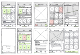
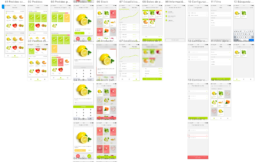
I start by establishing all the possible use cases, making a quick sketching of the different screens, distributing the information architecture with the main elements and establishing the navigation flows between screens.
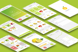
On the main screen, I place a summary of all the orders, in this way, the user has a quick visualization of the products of that order before starting to prepare them.
The order preparation screen is the simplest, it has a Tinder-like interface to help the user to check one by one the products and the quantity that has been placed in each bag.
In the inventory screen, the user could see all the supplier’s products with the stock synced. For those providers without this system, the user could select the products to enable or disable directly from this screen.
I test these prototypes with some vendors through usability tests to discover improvements or errors. Some we do in person at their workplace and others remotely. I got help from the Foods team.
The feedback we got helped me a lot to iterate design solutions, improve the experience, and add new functionality. Going back to testing these new solutions, again, with users.
One of the interesting discoveries was that, due to the speed of preparation and the number of orders, it was difficult for them to visualize the completed ones. So I help to visualize this process graphically using green, orange and red colors to represent the “complete”, “incomplete” and “pending” status respectively.
Finally, I wrote all the specifications and requirements in the Product Requirement Document (PRD) an extensive and detailed documentation with mockups, scenarios, user stories… to facilitate further development.
Once the application was launched, we began to measure, among others, the impact of the main KPIs to have a traceability of the objectives and detect points for improvement. We compare the first results with the research carried out initially:
Reduction in order preparation time by 24%. This was significant to them, because it expanded Foods’ scope for scalability for each vendor.
Increase in the efficiency of completed orders by 85%, thanks to the update of stock with the supplier and the possibility of reviewing each product of each order one by one.
Total elimination of the time of preparation of the orders to the suppliers on the part of Foods. They no longer had to send orders by hand as they were shipped automatically.
I was very happy to work with the Foods team again and that they trusted me again a few months after my stay in Santiago de Chile.
