CompanyGuruwalkProjectNew Product Detail PageYear2022Linkguruwalk.comRoleHead Product Designer
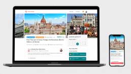
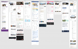
Since the beginning of Guruwalk, the Tour Detail Page (TDP) had practically not changed, despite being one of the most important pages on the platform since it directly affected the user’s decision and therefore the conversion process.
Travelers, also called “walkers,” landed on this page after comparing several tours to see the full tour description. It contains relevant information such as the description, images, comments from other travelers, available schedules, among others.
The objective of this page was to help choose the tour and the main action was to choose the time and language to book the tour.
During a brainstorm the team decided that improving this page could help increase conversion. It was a critical point in the booking process where any failure or improvement on this page would directly affect the conversion rate. Because of this, and because there were many different improvement points, it was decided to address each of them individually and test them independently and iteratively.
My responsibility as Head of Product Design UX/UI at Guruwalk was to redesign this page, starting by conducting research with users to find problems or possible points of improvement, and then pose new hypotheses and test them with users.
We work with Scrum methodology, executing weekly sprints in a collaborative environment and in constant communication. For my part, I worked with the Design Thinking methodology, coordinating my deliveries with the team’s sprints.
Skills
This project strengthened both my strategic and executional skills, making me a well-rounded Product Designer capable of blending business needs, user insights, and technology
Tools
Some of the main tools I used to carry out this project
I started doing research (qualitative and quantitative) through interviews, surveys, data analysis and observation of user behavior to understand their needs, problems and desires.
Interviews - understand by qualitative methods
I interviewed some “walkers” to understand what they valued about this page and what problems they had. I conducted the interviews with Loom and, at one point, I showed them the page so they could explain to me how they had navigated their last real experience, thus obtaining, in this way, the use case was real.
I realized that these opinions were different depending on the user profile or user persona (personas are representations of a group of users with similar behaviors, objectives and motivations):
They usually travel with friends or family, they usually visit their own country or their own city, they take free tours as a leisure and entertainment activity or to live an experience, which is why they look for tours with different and special themes.
- The theme of the tour is the most determining factor when choosing it, they seek to be entertained, have fun and live an experience.
- The tour description is the second most important factor in knowing what to expect from the tour and whether it meets your expectations of entertainment and fun.
- The opinions are relevant to know the experience of other people and assess the quality of the experience and the guide.
- The points of interest are not such a determining factor when choosing the tour since they do not carry out the tour for tourism or to visit tourist sites.
They usually travel alone or as a couple, they are experienced in free tours and travel the world, they usually take longer trips to more distant places. They are looking to take free tours to experience the local culture with a local guide.
- They value that there is a diversity of tours on the platform to be able to see the different options, which they consider to be a differentiation factor compared to the competition.
- Based on their experience, they choose tours with certain characteristics, for example: they consider that tours that last a short time have fewer things or are of poorer quality.
- If they do not have availability for the date they are looking for, they do not mind adapting and doing the tour another day while they are still in the city.
- They look for complementarity of tours, given the number of tours they do, cross-selling is very important for them
They usually travel as a couple or with friends, they mainly look for essential tours where they can learn about the history and the most touristic places in the city.
- The language of the tour is the most determining factor when choosing it, preferably in your primary language or, failing that, your secondary language.
- The number of reviews along with the score is perceived as the demand for the tour, which conveys greater confidence and security if it is high.
- They usually review the top reviews, especially what was the reason for the most negative reviews.
- The availability of schedules is another important factor when choosing a tour, however, they can adapt to the schedule if they want and are able to do it, although the date is a more determining factor, since they are usually only a few days away. the city.
- Points of interest are a determining factor when choosing a tour because it allows you to know how many tourist sites you visit and to be able to compare between several tours to appreciate the differences.
- The location where the tour ends is relevant to fit in with other activities or going to eat (in case it is a morning tour).
- The map with the route is interesting because it allows you to get an idea of the route and duration.
Data analysis - check our internal data
Although there was no usage data because the calendar was new, I did a deep analysis of internal data, I spoke with the different areas of business, marketing and data analysis to collect all the possible data of the current process.
- Only 20% of the tours had an itinerary indicated in their description
- Each user took an average of 1.8 tours before booking one.
- There were more than 1,800 tours in more than 80 countries, with multiple different themes
- Each tour had an average of 12 photos, the minimum being 5 and the maximum being 24. The size of these photos was not controlled, so each guide could upload the size they wanted, the usual being 680px high.
- There was an average of 2 schedules per tour (one in the morning and one in the afternoon), with the tour having the most schedules including 48 on the same day, in more than 16 different languages.
Safari - understanding by observation
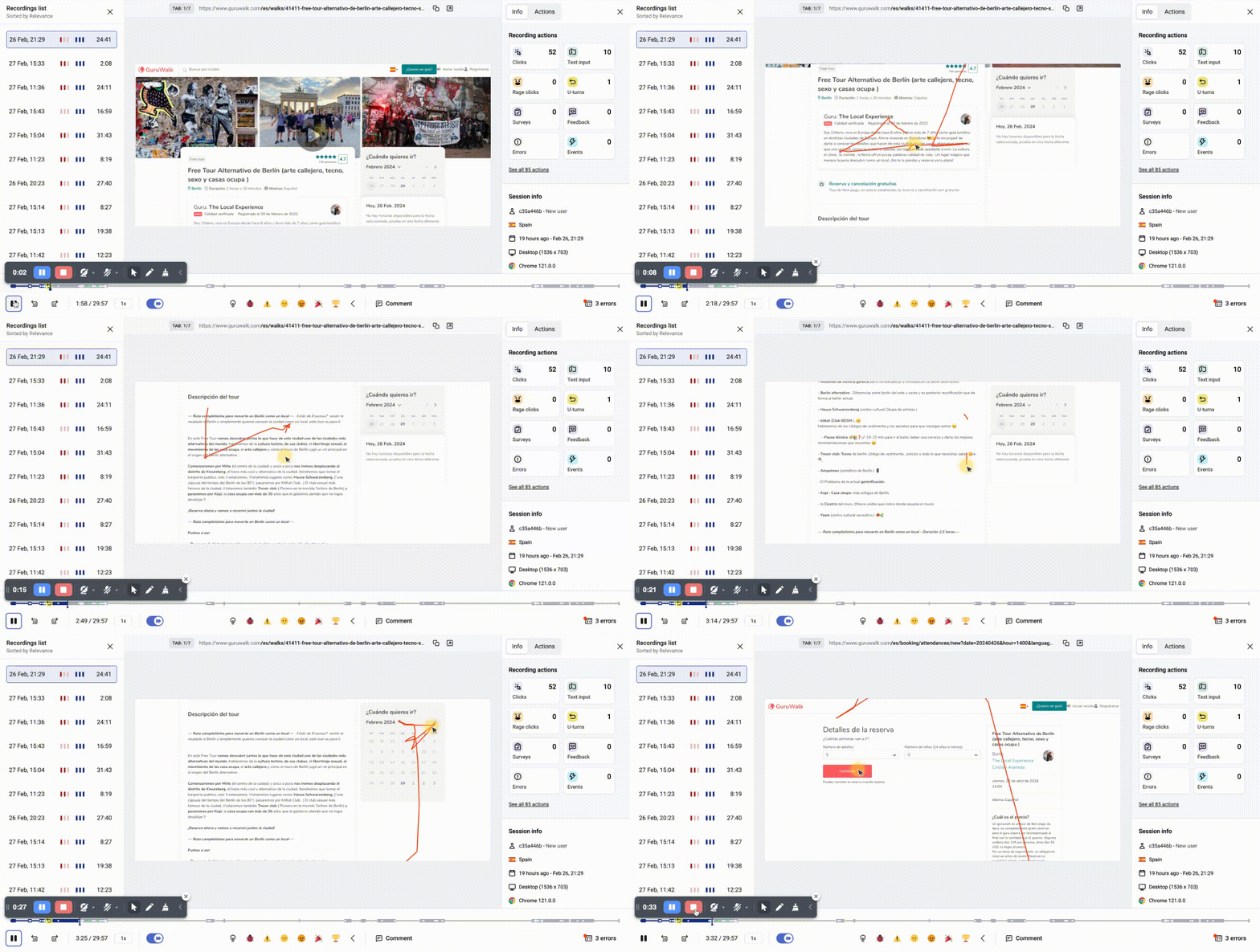
On the other hand, I observed the behavior of our users with the current management of their schedules on our old platform to understand their current needs and problems directly through screen recordings made with Hotjar.
- I realized that several users seemed to have difficulty selecting an event, they did not seem to understand the different times and languages, navigation was complex
- Many users enlarged the images to see the places they visited, however their presence on the product page was minimal, since they were shown in a reduced size and in a secondary part, and only one photo was shown despite having some tours up to 25 different photos
- Some users wanted to see the tour itinerary, however, some tours had them in the description and others did not, it was something optional that the guide decided to include or not, many of them did not include it for fear of having the tour copied
Reviews - know what they are telling us
Another point I addressed were the queries to Customer Service (SAC), as well as the opinions in the reviews and the comments left on our website Voice of Customer (VOC), related to the Tour Detail Page (TDP). Some interesting comments:
From what I had researched, the Tour Details Page (TDP) was the most important in the conversion process, along with customer reviews, tour description and availability was key in making the decision whether to take a tour or not.
I proposed, together with the product team, different ideas and improvement proposals that would allow each of the different user persona to have easily accessible what was most important for each of them. A single page, without going to the extreme of personalization, since each user could behave differently on each trip.
Ideas - aligned with business needs
We presented all the ideas with the team in a prioritization matrix (effort/value):
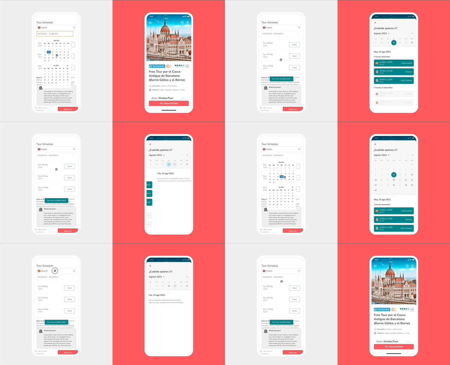
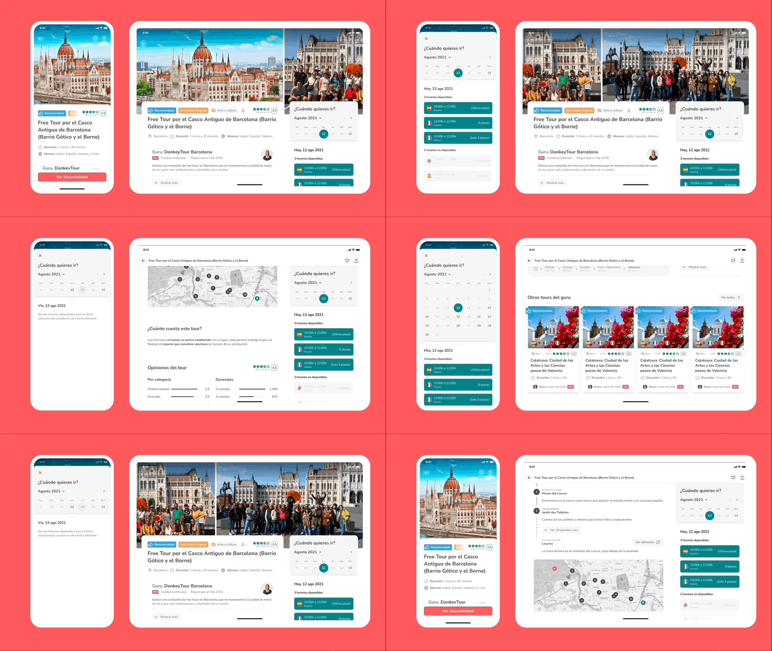
- Improve the selection of schedules, allow navigation by month and week, selection of schedules and language more simple and intuitive
- Highlight the photos, improving their location and showing the great variety of photos that each guide had, using the most widespread size as a basis for this redesign
- Expanding the guide’s description, to show the multifaceted variety of each of them, there were historians, architects, professors…
- Show detailed statistics in the reviews to expand information, as well as the latest reviews of the walkers
- Add the itinerary in list and visual form, to help better understand the differences between tours and improve cross-selling
- Show a carousel with other cities, to show the value proposition of being in almost every city in the world
- Show tags also on this page, to have narrative consistency throughout the page
I started by drawing the wireframes by hand and discussing their usability with some team members to quickly detect usability issues quickly.
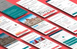
Once they were quickly validated with a few users, I made the pixel perfect mockups with Figma and created the interactive prototypes, transitions and animations to be able to do the user tests later.
User testing
I interviewed some “walkers” with Lookback (a screen recording tool), my goal was to observe the behavior of users through a remote usability test of the “new tour detail page”.
I understood how effective, efficient and satisfactory the proposed solution was to, in this way, discover problems, improvements or gaps that help us iterate design solutions based on user feedback.
I documented all the specifications and design requirements from mockups, and user stories, to facilitate development. Coordinating and prioritizing development together with the Product Manager and the Product Team.
The new Tour Detail Page (TDP) was launched in phases at the end of 2021, some of them we used A/B testing framework to verify that it works correctly.
A/B testing
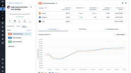
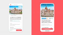
Another of the experiments we carried out was to improve the user experience of booking a tour, making it simpler and more intuitive, improving by 2.11% the conversion rate (booking to tour) (from 27.26% to 26.70%, a total increase of 0.44%), reaching statistical significance with a confidence level greater than 90%.
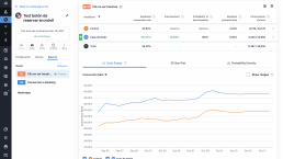
One of the experiments we carried out was to change the copy of the button, from “Book now” to “See availability”, improving by 16.66% the conversion rate (click on the button) (from 33.62% to 39 .22%, a total increase of 5.6%), reaching statistical significance with a confidence level greater than 95%.
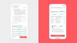
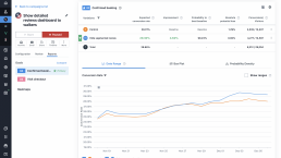
Another of the experiments we carried out was to show more details of the reviews, such as detailed statistics, improving by 4.62% the conversion rate (booking a tour) (from 28.01% to 29.30%, a total increase of 1.29%), reaching statistical significance with a confidence level greater than 95%.
Heatmaps
The heatmaps, click maps, scroll maps… were also checked to verify that the relevant and searched information was above the fold
In total the new page improved, among other metrics:
+12,5% Conversion, improving company income
+35,8% Satisfaction, improving user experience
+5% cross-selling, increasing profit per user
