CompanyGuruwalkProjectNew Supplier CalendarYear2022Linkguruwalk.comRoleHead Product Designer
Company
GuruWalk is the biggest marketplace for tours based on tips around the world, with more than 300k users/month and more than 1.8k tours in more than 650 cities.
Suppliers
Tour suppliers are agencies, guide groups or independent guides, also called “gurus”. They create their schedules on the platform and offer their availability to Guruwalk, allowing walkers to book during those times.
Problem
Until then, the only way to create schedules in Guruwalk was through the old process of creating a tour, or subsequently editing it. But there was no easy and graphical way to see all your schedules and enabled availability.
This created different problems, the guides sometimes created events that they did not even know existed, which generated problems with no-shows or subsequent cancellations.
Objectives
- Reduce cancellations and no-shows by guides due to not being able to view their event calendar.
- Facilitate the day-to-day management of their events, improving the user experience.
Constraints
One of the difficulties was that there was a great disparity of users or roles that were going to manage the calendar such as schedule manager, checkin manager, guide… among others, who would use it in different ways for different uses.
Another difficulty, and perhaps the most complex, was that each “guru” could offer several tours during a day, each tour in several languages and each language at several different times, and these, in turn, were different between each one of the “gurus”, so a calendar had to be made that would serve each and every one of them.
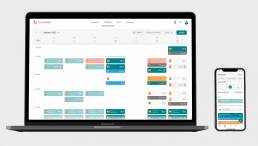
My responsibility as Head of Product Design at Guruwalk was to create this new calendar interface and user experience that would allow “gurus” to manage their schedules in a much simpler and more intuitive way than the previous system allowed.
We work with Scrum methodology, executing weekly sprints in a collaborative environment and in constant communication. For my part, I worked with the Design Thinking methodology, coordinating my deliveries with the team’s sprints.
Skills
This project strengthened both my strategic and executional skills, making me a well-rounded Product Designer capable of blending business needs, user insights, and technology
Tools
Some of the main tools I used to carry out this project
I started doing research (qualitative and quantitative) through interviews, surveys, data analysis and observation of user behavior to understand their needs, problems and desires.
Interviews - understand by qualitative methods
I interviewed some “gurus” to understand how they were managing their schedules
Data analysis - check our internal data
Although there was no usage data because the calendar was new, I did a deep analysis of internal data, I spoke with the different areas of business, marketing and data analysis to collect all the possible data of the current process. Some relevant data:
- There were 5,550 total tours (2,986 open tours – 2,564 created tours), that was an average of 1.72 tours per guru
- 31 tours have more than 6 events on the same day (the ones with the most are 38 and 22, then the rest from 13), only 10 tours have more than 10 events on the same day.
Safari - understanding by observation
On the other hand, I observed the behavior of our users with the current management of their schedules on our old platform to understand their current needs and problems directly through screen recordings.
- Blocking and unblocking events is a functionality that some gurus use a lot on a daily basis, however the list of events to block and the functionality of blocking by date range is complex and it is difficult for the guru to find the event you are looking for, making you waste a lot of time, does it make sense to make a calendar with the events more visible and accessible? enable filters in event listing view?
- To block events, the guru goes to “My tours” and selects the tour, goes to the tour page, clicks on “Block events” and then “Block events individually”, would it make sense to access this functionality in a way easier? from a calendar view?
- The contact import service was hardly used, the available options included outdated email services such as MSN or AOL, among others, that were not being used. What generated a feeling of antiquity and lack of maintenance of the service (nothing is further from the truth).
Benchmark - testing competitor solutions
In addition, I did an intensive benchmarking of the multiple solutions of different platforms, best practices and market studies that helped me to acquire knowledge so as not to start from scratch.
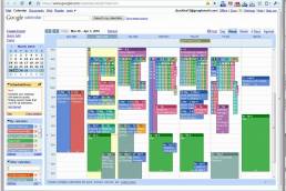
- One of the main problems with the fixed arrangement of hours in some calendars known as Google Calendar was the grouping of events in the same hour, which made it unmanageable (some schedules had more than 38 events)
According to what I had researched, we thought that a calendar would be a simple and visual way to see the available events, as well as he availability and the number of people who were signed up for a tour. Additionally, they could also manage (add, modify and edit) these events.
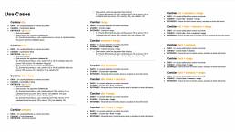
I explored different ideas, improvement proposals, scenarios and use cases to solve these problems and shared them with the product team in different co-creation sessions until we were left with the more important, we left the rest for later:
Ideas - aligned with business needs
We presented all the ideas with the team in a prioritization matrix (effort/value):
- View schedules by start time to group all events at the same time
- Add filters by tour, language and with reservations, for those agency calendars that have multiple schedules and events
- Top navigation by day to move more quickly through the week
- Change to monthly view, to be able to see events grouped by day
- Export event calendar to other platforms you already use
- Eliminate the “canceled events” section, since they barely use it
- Simplify event information to the minimum necessary: tour, language and number of attendees
- Inform the status of the event using the color of the card: available, with reservations, canceled, pending confirmation…
- Keep the interface clean and simple that helps you focus on the events, eliminating distractions and unnecessary elements
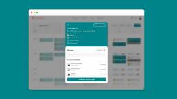
- Open event details in a new window to focus on event management, visualize attendees, modificate schedule, cancel event…
- Block or unblock events from calendar view
I started by drawing the wireframes by hand and discussing their usability with some team members to quickly detect usability issues quickly.
Once they were quickly validated with a few users, I made the pixel perfect mockups with Figma and created the interactive prototypes, transitions and animations to be able to do the user tests later.
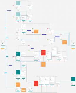
Finally, I designed the navigation flows with Overflow so that the development team could develop it and the QA team check that everything works correctly.
User testing
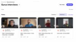
We interview some “gurus” with Loom (a screen recording tool), my goal was to observe the behavior of users through a remote usability test of the “new calendar” to understand:
- Page and element understandability
- Usability check availability
- Event blocking usability
- Usability cancel or modify reservations
- Usability add new schedule
- Usability mark no-shows
I understood how effective, efficient and satisfactory the proposed solution was to, in this way, discover problems, improvements or gaps that help us iterate design solutions based on user feedback:
- A filter should not appear if a guide only has one item to filter (e.g. a guide only has one language but two tours, the tours filter should appear but not the languages filter)
- The points should be associated with calendar events, specifically to reservations, it might seem more interesting depending on the users, but I think they should be associated with the filter.
I documented all the specifications and design requirements from mockups, scenarios, navigation flows and user stories, to facilitate development. Coordinating and prioritizing development together with the Product Manager and the Product Team.
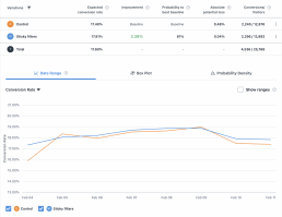
The calendar was launched in phases at the beginning of 2022, some of them we used A/B testing framework to verify that it works correctly.
A/B testing
Through experimentation we were able to realize that adding the new interface improved some behaviors, some of them were:
- The download button was clicked a lot but the content did not finish downloading and we found that it was due to a problem that did not work for some
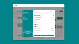
- The event display window was having problems, some users were complaining that they couldn’t display all attendees correctly, so we changed it to a two-column format
The calendar was launched in phases at the beginning of 2022
32% reduction in gurus cancellations or no-shows due to not viewing events
62% of the visits of the “gurus” daily are to this page, it is the most used section of the “gurus” admin
95% rate the calendar section satisfactorily with a score of 4.7 out of 5, it is the best rated section of the “gurus” admin
Some reviews from “gurus” regarding the calendar:

