CompanyPrivaliaProjectNew Login & RegisterYear2018Linkes.privalia.comRoleLead Product Designer
Far is the private sales club that was Privalia in its beginnings, an exclusive ecommerce that generated scarcity and desire. Where you could only access by invitation or request and, who knows, maybe you were “lucky”.
Over time, it evolved towards a more open model, where it’s practically not necessary to register until, practically, when you go to pay. Because, beyond marketing strategies, the really important thing in an ecommerce is to sell.
At Privalia we have been using the same registration / login process for several years. The user could navigate through a public part but, at a point in the purchase process, they were asked to register to continue.
The business was interested in improving this process to allow a unified registration between the two platforms that Privalia had at that time, as well as laying the foundations for a completely public navigation, without the need for registration.
Therefore it was proposed to create a new record / login. From the UX department, we saw this as an opportunity to improve the user experience by making it easier and more intuitive for the user and, in turn, meeting business objectives.
Privalia’s Advertising Technology (AdTech) team, in which I participated as a Lead Product Designer (UX / UI), was in charge of carrying out the new Login & Register. My responsibility was to design a new, simpler and more intuitive experience that helps users navigate throughout the process.
We work with Scrum methodology, executing weekly sprints in a collaborative environment and in constant communication. For my part, I worked with the Design Thinking methodology, coordinating my deliveries with the team’s sprints.
Tools
Some of the main tools I used to carry out this project
sketch_logo
Zeplin
Protopie
Proto.io
Overflow
Google Analytics GA4
Hotjar
Lookback
Typeform
Jira
Mixpanel
Trello
Usertesting
I started doing research (qualitative and quantitative) through interviews, surveys, data analysis and observation of user behavior to understand their needs, problems and desires.
Reviews - know what they are telling us
I looked up the reviews of the main stores and the customer service center regarding login and registration.
Data analysis - check our internal data
In addition, I did a deep analysis of internal data, I spoke with the different areas of business, marketing and data analysis to collect all the possible data of the current process.
Safari - understanding by observation
On the other hand, I observed the behavior of our users with the registration and login process on our platform to understand their current needs and problems directly through screen recordings.
Benchmark - testing competitor solutions
Finally, I did an intensive benchmarking of the multiple solutions of different platforms, best practices and market studies that helped me to acquire knowledge so as not to start from scratch.
- More fields meaning less conversions. Privalia has 5 fields in the registration form. Every field we ask them to fill increases friction. This study increase a 120% the leads while the quality of submissions stayed the same. This study lose out on 3,2% the conversion using captcha
- Multi-step forms reduce psychological friction. This way the form appears less overwhelming and feels faster to progress through. Multi-step form can increase conversions from 11% to 46% (x7 leads) according to this study
- Users base their trust on the design and the appearance. An innovative and updated design can increase conversion rates between 20% and 40% according to this study
A/B Testing - validate hypothesis fast
There was some data that we did not have and, as there was already an active login / registration, we checked how it was working using A/B testing in Apptimize. For example, we tested the proposal to show the modal gender after registration and we verified that only 2.57% on average skipped this modal window. Therefore it was a valid hypothesis.
In the results of my research I discovered several problems, as well as some good solutions that we were already using:
Main Insights
- Around 40% of users registered with Facebook Login compared to the remaining 60% who registered with email and password.
- On average 60% of users who download the app in all countries DO NOT accept to receive push notifications.
- We had a 35% drop in the acceptance of tracking and profiling in the registration form, this is the acceptance of cookies due to the new GDPR regulations that allowed us to send communications via email, this was critical because the main source of visitor capture and sales in Privalia is outbound, mainly based on sending emails with offers.
- Apple forced us to hide the gender of the registration field in our iOS application, but for us it was important because of the personalization of content by email (profiling).
- Is unnecessary to show up to 3 times the Facebook button. In “login” and “register” screens, because it’s the same button with different copy. This is recommended by Facebook in its best practices.
- We show a screen "Accede a Privalia con tu Facebook" that around 80% of users who register with Facebook skip because they do not have a previous account with Privalia. Why show it then?
- One of the main reasons when a user registers with Facebook is to not create a password. After logging in with Facebook, people are especially reluctant to create a password, but we asked them to enter a password.
I explored different ideas, improvement proposals, scenarios and use cases to solve these problems and shared them with the UX team, the Advertising Technology (AdTech) team and the marketing team in different co-creation sessions until we were left with the more important:
Ideas - aligned with business needs
The login or registration is the first experience that a Privalia user has and, as such, it should not be missed:
- Solve the registration or login errors that prevent many users from being able to buy and affect the business.
- Show value proposition, clearly defining the value proposition of filling out the form.
- Make it difficult to skip the login, Make it difficult for the user to skip the registration process.
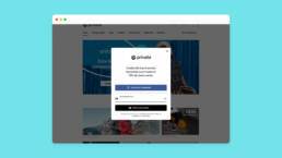
- One login / register process. Simply continue with the email and verify if that email already exists and take him to the registration form or login form. There’s no need for people to even have to stop to think about if they have an account or not.
- Allow social login, this attracts the users as this feature eliminates the need to remember another password.
- Auto focus on the first field, auto focus on the first input field in the form. This saves the user time and effort of clicking on the input field. One thing per page, low-confidence users find them easier to use and simple, además es más mobile friendly.
- Minimum amount of information, asking for email and password should be enough. Avoid asking, at this stage, info like gender, name or other information that is not essential. We’ll guide the user to complete it later.
- Ask for permits at the right time, ask for native permission only when we know you are receptive to accepting them, such as when you place an order.
- Hidden communication acceptance check when autofocus, scrolling can be seen, I’m not a supporter of dark patterns but accept this check is critical to Privalia business and outbound marketing.
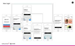
To make the prototypes quickly, I drew the wireframes by hand and digitized and animated them with Marvel, this helped me to perform the first user tests quickly.
Once they were quickly validated with a few users, I made the pixel perfect mockups with Sketch and created the interactive prototypes, transitions and animations with Protopie to be able to do the user tests later.
Finally, I designed the navigation flows with Overflow so that the development team could develop it and the QA team check that everything works correctly.
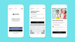
User testing
We sent 20 emails with the test in Lookback (a screen recording tool) made with Protopie to friend & family users. Our goal was to observe the behavior of users through a remote usability test of the “new code-based registration process” to ensure that they could:
- Register with their email
- Create a secure password
- Enter their MGM code
- Read the GDPR
And understand how effective, efficient and satisfactory was the proposed solution to, in this way, discover problems, improvements or gaps that help us to iterate design solutions based on user feedback.
I documented all the specifications and design requirements from mockups, scenarios, navigation flows and user stories, to facilitate development. Coordinating and prioritizing development together with the Product Owner and the AdTech team.
After developing the minimum functionalities, we launched it using an A / B testing framework to a 20/80 sample to verify that it works correctly.

The final project was not launched because Vente-Privee and Privalia merged into Veepee in January 2019 and began a platform merger effort, crippling any project or development at Privalia to date. However, I am happy with the work done and for me it was a learning experience.